Flowcytometry (FACS) data analysis
- Feb 1, 2019
- 2 min read
Flowcytometry data analysis is mostly done by softwares with limited options of statistics and plotting parameters. Here we are writing an open source code, where the data is first imported in the form of .fcs and then transformed into .xls or .csv format so that the users could visual each and every value of data points. This in turn will help in analyzing the data and plot different types of graph.
Data importing, viewing, gating and saving:
The FACS data is stored either in *.fcs (Flow cytometry standard) file format. The data required software to view. In order to view the software
>if (!requireNamespace("BiocManager", quietly = TRUE))
+ install.packages("BiocManager")
>BiocManager::install("flowCore", version = "3.8")
>BiocManager::install("gatepoints", version = "3.8")
>library(flowCore); library(flowViz);library(gatepoints)
In order to choose the file from the destination folder, the following command:
>file.name = file.choose()
File_name <- read.FCS(file.name)
>str(File_name)

>head(exprs(File_name)
>y <- exprs(File_name)
>y <- data.frame(y)
>dim(y) # Number of rows (events) and columns(parameters)
[1] 50000 10
>attach(y)
>head(y)

#FSC vs SSC is plotted to exclude the debris or for gating the desired samples
> plot(FSC.A, SSC.A, main= "SSC vs FSC_Sample.Y", log= "xy"
+ , xlab= c("FSC-A"), ylab= c("SSC-A"), cex =0.1)
> Total.events <- nrow(y)
> Df.Total.events<- data.frame(Total.events)
> colnames(Df.Total.events) <- c("Total Events:")
>legend("topleft", legend = c(paste(colnames(Df.Total.events),Df.Total.events)),
+ cex=1)
# This will plot figure as shown in Fig A (FSC vs FSC)
>Gate1 <- fhs(y[, c("FSC.A","SSC.A")],mark= TRUE, col= "red", cex= 0.01) # fhs () is the free hand selector toll to gate the events as Gate1
# This will add Gate to figure of A and the final fig is shown in B
>y.gate1 <- y[Gate1, ]
> dim(y.gate1) # Dimensions of rows x columns.Rows indicating events and columns indicating parameters
[1] 33360 10
>Gate1.events <- nrow(y.gate1)
>Gate1.Per <- c((Gate1.events/Total.events)*100)
>Df.Gate1<- data.frame(Total.events, Gate1.events, Gate1.Per)
>colnames(Df.Gate1) <- c("Total Events:", "Gate Events:", "Gate1 %:")
>legend("topleft", legend = c(paste(colnames(Df.Gate1),Df.Gate1)),
+ text.col =c(“black”, "red", ”red”)
+ cex=1)
# This will plot the graph with legends as shown in Fig. B (Gate 1 applied based on FSC and SSC coordinates)
>write.csv(y.gate1, file= "filename_gate1counts.csv") # In case we want to save events associated with selected points of Gate1
# Analyzing and gating the second sample with same applied gates as shown in Fig B
> y1 <- sample_2 # Second sample
> plot(y1$FSC.A, y1$SSC.A, main= "SSC vs FSC_Sample 2", log= "xy"
+ , xlab= c("FSC-A"), ylab= c("SSC-A"), cex =0.1)
> Total.events <- nrow(y1)
> Df.Total.events<- data.frame(Total.events)
> colnames(Df.Total.events) <- c("Total Events:")
>legend("topleft", legend = c(paste(colnames(Df.Total.events),Df.Total.events)),
+ cex=1)
# This will plot Fig as shown in C (FSC vs SSC_ Sample 2)
> attributes(Gate1) # Gate1 with x,y coordinates
$`gate`
x y
1 197.3709 52.57536
2 187.6672 115.04166
3 247.6338 412.77270
4 598.3701 1065.07009
5 1307.1940 2146.11980
6 3406.7652 6266.38255
7 7442.3895 8713.75815
8 9820.5107 9462.42939
9 10071.2064 2863.80857
10 4727.7961 364.76675
11 1814.0806 79.39040
12 809.7276 33.41165
13 218.3096 39.39964
> p <- data.frame(attributes(Gate1))
> points(p, col= "red") # This will plot only points with coordinates of attributes of Gate 1 in Fig. C that is displayed in Fig. D
> Gate1 <- fhs(y[, c("FSC.A","SSC.A")],mark= TRUE, col= "red", cex= 0.1)
Mark region on plot.
> y1.gate1 <- y1[Gate1, ]
> Total.events <- nrow(y1)
> Gate1.events <- nrow(y1.gate1)
> Gate1.Per <- c((Gate1.events/Total.events)*100)
> Df.Plot1<- data.frame(Total.events, Gate1.events, Gate1.Per)
> colnames(Df.Plot1) <- c("Total Events:", "Gate Events:", "Gate1 %:")
> legend("topleft", legend = c(paste(colnames(Df.Plot1),Df.Plot1)),
+ text.col =c("black","red", "red"), cex=0.7)
This will plot the Figure D as shown below (FSC vs SSC_ Sampe 2 with same applied gate as that of Fig. B

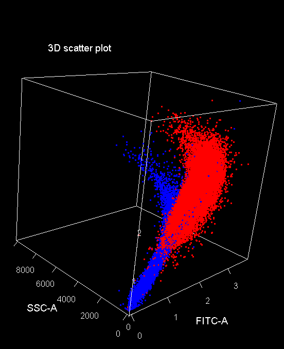
Next chapter: Studying the gated events with different parameters (flurochromes; FITC, APC, etc.)


Comments